We store cookies, you can get more info from our privacy policy.
WiiU

First Look at Wii U Game Case Design

by Andrew Brown - August 8, 2012, 6:38 am EDT
Total comments: 32 Source: (GameTrailers), http://www.gametrailers.com/side-mission/24589/our...

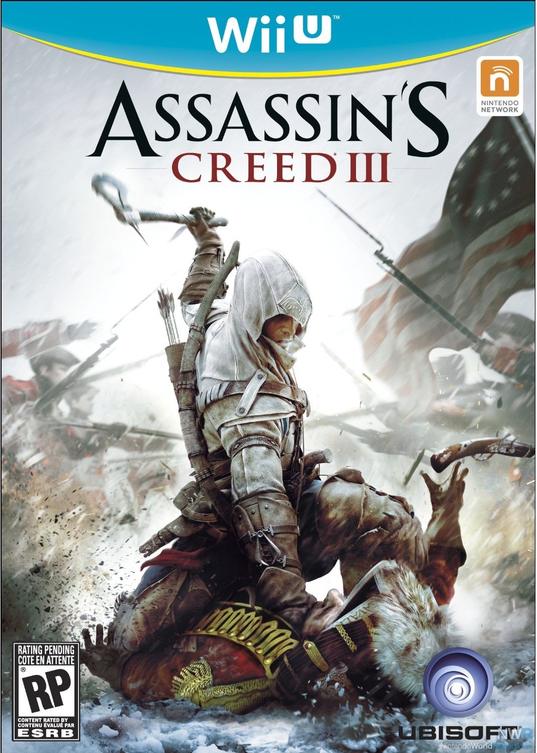
Amazon and Target leak the Wii U game cases.

The first images of a Wii U game case have been leaked to the internet by Target and Amazon. The case features a blue curve across the top, reminiscent of the GameCube case designs. Beneath the curve is a yellow bar, which doesn't appear to have any color significance in relation to the Wii U console or GamePad.

The only listed titles to show this design were those developed by Ubisoft, who have confirmed the cover art as legitimate.

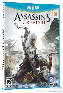
A secondary image for Assassin's Creed III on Target's listing also reveals that the case will be made of light blue plastic, as opposed to the Wii's white and GameCube's black cases.

Images

Talkback

Chozo GhostAugust 08, 2012

I think that bar is just simply yellow. It might seem greenish depending on how you look at it, but that is probably because green is what you get when you combine blue and yellow together, so with those two colors being so close maybe that's why it could appear green in a way? I don't know.

pololmejorAugust 08, 2012

It looks beautifull. I can't say the same for the plastic, but I'll get used to it. Just one more thing left... or two: Date and pricing wich shall be umm $300 for WiiU, $60 for games and last weekend of November?

joshnickersonAugust 08, 2012

@ Chozo Yeah, it looks yellow to me too.

I like it. It separates the Wii U games from the standard Wii games, yet it manages to keep the same clean aesthetic.

Chozo GhostAugust 08, 2012

I can't help but wonder what the Wii U's "Player's choice" or "Nintendo Select" or whatever titles will look like. I'm sure we won't see those until at least a couple year's into the Wii U's life, but it doesn't hurt to think about it now.

Regardless of how green or yellow the bar is, I still find it odd that it doesn't seem to match any part of the console. I speculate that it's possibly a last minute disc slot glow color that hasn't been revealed yet. I'm most likely wrong about that, though.

broodwarsAugust 08, 2012

Quote from: King

Regardless of how green or yellow the bar is, I still find it odd that it doesn't seem to match any part of the console. I speculate that it's possibly a last minute disc slot glow color that hasn't been revealed yet. I'm most likely wrong about that, though.

Well, I've seen this shade of blue used as a secondary color on Wii accessories, manuals, the insides of Wii boxes, and even the Wii point cards IIRC.  So the color's definitely associated with the Wii brand, and I see they're back to using the banner style of the old GameCube cases.  The cases should be large enough and the blue different in shade enough for less-involved consumers to avoid mistaking these for Wii or PS3 cases...at least so long as the cases are visible from the front.  If these are lined up so you can only see the spine, I can see some confusion arising due to it looking pretty much like a Wii case aside from the logo.

I liked this design on the GameCube cases, so it works fine here as well.  I would have perhaps preferred some kind of embossing on the banner and some other design or text within it to cut down on all that unused space, but overall it looks pretty decent.

Killer_Man_JaroTom Malina, Associate Editor (Europe)August 08, 2012

Looks pretty nice and does a bit better of a job of distinguishing itself from Wii game boxes than 3DS boxes did from DS boxes.

martyAugust 08, 2012

I wish packaging looked more like http://www.palesky.com/misc/gaf_collection_collected/
The aesthetic quality would improve drastically if the industry could do without 4+ different logos plastered across the front of every case.

Quote from: broodwars

Well, I've seen this shade of blue

Wha?
I'm talking about the thin bar below the blue arching curve, underneath the "Wii U" logo.

broodwarsAugust 08, 2012

Quote from: King

Quote from: broodwars

Well, I've seen this shade of blue

Wha?
I'm talking about the thin bar below the blue arching curve, underneath the "Wii U" logo.

Yeah, this is why I don't like getting up so early these days.  It starts messing with my reading ability.  :P:  Unfortunately (unless they wanted to use Black), Yellow or Green are the two colors that contrast best with light blue that they could use there.  They probably can't use White as a border color because you have to allow for developers to have light-colored front covers .

motangAugust 08, 2012

I like it, it's different.

Chozo GhostAugust 08, 2012

I was one of the few people in the world who was actually a fan of the Gamecube, so seeing any sort of tribute being done to the old Gamecube way of doing things makes me happy. Even though the name is Wii U, maybe it would be more accurate to think of the console as the "Gamecube U"?

SonofMrPeanutAugust 08, 2012

This just in: The Wii U is "too legit to quit."

Ian SaneAugust 08, 2012

There's something that seems old about it to me.  Maybe I just associate it too much with the Cube cases and those certainly look old today (they're not yet old enough to look retro).  I didn't really like the Cube case look and I think it's because it stood out too much as a Gamecube game.  That approach makes sense from a marketing point of view as you want your system's game to "pop out" on the shelf (the original Xbox games can be spotted a mile away with those green cases) but it doesn't look as nice from a collector's perspective.  Of that gen I liked the PS2 case the best because it was just a black bar at the top and black comes across as very neutral.  Your eye naturally focuses more on the box art than the branding.  This gen I liked the PS3 cases the best until Sony switched to this red font that makes every game look like a Greatest Hits title.  I prefer if my casing just makes it look like a videogame, instead of it acting like an ad for the system itself.

Of course the Cube's purple colour made it worse (though the Xbox green looks WAY sillier in retrospect) as that isn't a very neutral colour and I would never choose to cover a book shelf with purple items.  Blue is a much better colour, and I liked how the Wii used white.

In the NES days you got a lot more variety with the covers as the shape and the Nintendo seal were the only truly common elements.  Plus different publishers had their own scheme at times.  Nintendo originally had the black boxes with the blocky graphics, Capcom had the grid, Konami had the silver boxes.  No console maker would go for that now because they want that branding in our faces but it would be nice if there was more freedom for the publisher to use whatever box art fits the game.

Chozo GhostAugust 08, 2012

The original xbox design and color scheme looked very much like that of the Borg cubes from Star Trek.

WiiUIVLifeAugust 08, 2012

I love the look of the Wii U box art.  Reminds me of a resurrected Nintendo GameCube box cover.  Fan-freaking-tastic!

KlonoahedgehogAugust 08, 2012

This style makes me feel all nostalgic inside.

mustbeburtAugust 08, 2012

i thought we already saw the game case design on this site.  here's a link for madden 13.


http://www.nintendoworldreport.com/game/30609

Kytim89August 08, 2012

I would have prefered that the mature rated Wii U games have a black case and cover to distinguish them from the non-mature titles.

ShyGuyAugust 08, 2012

You know why it's yellow? Wii Wii.

Darkurai the Oracle PonyAugust 08, 2012

Looks like Blu-Ray. I like it though.

ThePermAugust 08, 2012

heck

Quote from: broodwars

Quote from: King

Regardless of how green or yellow the bar is, I still find it odd that it doesn't seem to match any part of the console. I speculate that it's possibly a last minute disc slot glow color that hasn't been revealed yet. I'm most likely wrong about that, though.

Well, I've seen this shade of blue used as a secondary color on Wii accessories, manuals, the insides of Wii boxes, and even the Wii point cards IIRC.  So the color's definitely associated with the Wii brand, and I see they're back to using the banner style of the old GameCube cases.  The cases should be large enough and the blue different in shade enough for less-involved consumers to avoid mistaking these for Wii or PS3 cases...at least so long as the cases are visible from the front.  If these are lined up so you can only see the spine, I can see some confusion arising due to it looking pretty much like a Wii case aside from the logo.

I liked this design on the GameCube cases, so it works fine here as well.  I would have perhaps preferred some kind of embossing on the banner and some other design or text within it to cut down on all that unused space, but overall it looks pretty decent.

and scroll down, that same color(well about the same) is used on nintendo world report, and obviously the wii slot glows blue

edit:
also, now that i think about it, did NWR change their color blue? I could have sworn it was a lighter shade, now its the same shade as twitter blue.

edit again" it looks darker in the main page then it does on the forums.

BeautifulShyAugust 08, 2012

I like the cases but then again I always liked the colors that were tied to the Wii console. White and light blue. It works.

Bman87301August 08, 2012

Interesting... they're sticking with traditional DVD cases. I kinda assumed they'd be going with Blu-ray-type cases this time around.

Chozo GhostAugust 08, 2012

Quote from: ShyGuy

You know why it's yellow? Wii Wii.

The yellow band represents the Wii Stream (Stream was the codename for the system at one time, wasn't it?), and the Blue semi circle represents the blue ocean market that the Wii and Wii U are targetting. The Yellow Wii stream is circling that blue ocean the way a shark circles its prey.

ShyGuyAugust 08, 2012

Peeing in the pool, the "Yellow Ocean" strategy

NeoStar9XAugust 08, 2012

I do wish the case was smaller. Game cased in general really should be. Just big enough to fix the disc with a little extra so it isn't rubbing up against the sides. It's not like they include think manuals anymore.


However I do like the design and colors that were picked for the Wii U cases.

TJ SpykeAugust 08, 2012

Quote from: Bman87301

Interesting... they're sticking with traditional DVD cases. I kinda assumed they'd be going with Blu-ray-type cases this time around.

Why? I prefer the standard size of DVD cases, as it's used by DVDs, Xbox 360, Wii, GameCube, and PS2. I don't want oddball size like PS3.

BlackNMild2k1August 09, 2012

Quote from: pololmejor

It looks beautifull. I can't say the same for the plastic, but I'll get used to it. Just one more thing left... or two: Date and pricing wich shall be umm $300 for WiiU, $60 for games and last weekend of November?

You expect Nintendo to release the Wii on on Black Friday? I think you are the only one that would expect something like that to happen.

Maybe the friday before, but not ON Black Friday.

TJ SpykeAugust 09, 2012

Nintendo launches stuff on Sundays (at least systems). I think most people see the Sunday before Black Friday as the most likely date.

Pixelated PixiesAugust 09, 2012

I'm not really digging the covers to be honest. I think the baby blue and white colour scheme is a little too temperate and inconspicious. I also believe there is still going to be confusion among casual gamers as to whether or not Wii U games will play on their Wii, especially in today's market where a purple 360 box indicates that it's a Kinect supported game. If mainstream media outlets are getting confused, I guarantee you that some people will think they simply need to buy a Wii U controller to play these games. That's more a problem with the Wii U name rather than cover design though.

Ultimately I don't think the box design matters all that much. The design of the covers is the least of Wii U's problems as far as I'm concerned.

LouieturkeyAugust 09, 2012

Quote from: Darkurai

Looks like Blu-Ray. I like it though.

Looks nothing like bluray.  Bluray have shorter cases and much darker blue.

Got a news tip? Send it in!
Advertisement
Advertisement