Read about the trials and tribulations of developing Flip's character design.
The look of the main character is more important than all else. While it's key that all characters in a game look good, the main character is the face of the game, the brand. Your leading guy or gal needs to have some flair, something that makes him unique, like a symbol for the game and the franchise. How much more effort goes into the design of a lead character? Well, in Flip's case, hundreds of concepts over four months.

Humble Beginnings
Flip used to be a very different character. He didn't even have a name – he was just "The Apprentice." The original Apprentice was a timid, nerdy, scared child who was forced to be a reluctant hero. He was the star of "up&dn" (Up and Down), the original X07 demo, and the prototype for Flip's Twisted World. He had large glasses, a huge, floppy blue wizard's hat, and blue wizard's robes. "The Cube," a magical world-rotation device, hung around his neck – it wasn't a character at the time. He was taller, and had huge shoes. In this original form, The Apprentice was only a sprite.
When we began working on a better prototype to show publishers, we had to turn The Apprentice into a 3D model, and refine his design a bit further. The Apprentice was still a relatively simple character, but was given taller proportions, a mouth, a bit of hair coming off the back of his head underneath his hat, and a slightly less amorphous robe.
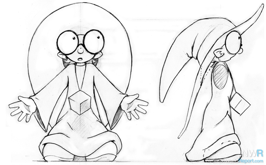
We initially liked the idea of a hero that was unlikely heroic all the time. We felt there was something inherently endearing about this type of underdog.
Our publisher, Majesco Entertainment, helped us see the hard reality that while the apprentice was "cute," people want to play as somebody "cool." He doesn't have to be James Dean, but somebody who we can believe would be willing to embrace a little adventure, and kick a little monster butt if need be. He can still be small and unlikely, but he has to have a certain spark to be the type of character that people want to play.
The More Things Change…
We wanted to get away from the original character in certain ways, while maintaining other elements. What we wanted to stay the same: He's a young male apprentice wizard.
What we wanted to change was the attitude of the character. This meant we needed his physical appearance to be very different.
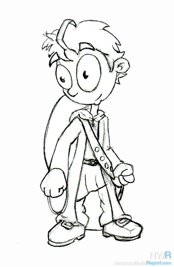
Here was one of our first revisions. The new Flip had big "orb-like" eyes. The robe was abandoned for an open cloak/overcoat look that showed more of his body. It's something robe-like without looking like the most boring archetypal wizard. Plus, a robe is very problematic technically for the animation process. We felt this piece of garb makes him look much more like an adventurer.
Flip's head was now bare, and hair with a prominent cowlick was present. Flip's hat was on his back so that there would be an indicator of his wizardhood remaining, without limiting what his head would look like.
Shadow Play
We tried various iterations of this character, but none of them passed the scrutiny of our publisher. They wanted to create a more unique and recognizable silhouette. During this stage, we explored more with his clothing, scaling back his coat so it no longer dragged on the ground, which would have also been a technical challenge. We dropped the hat from his back and started giving parts of his outfit sharper, less amorphous shapes that would be easy to pick out in his outline.
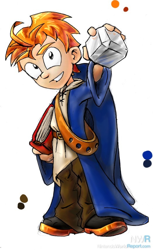
Throughout all our changes, the most difficult feature was the look of the head. We tried hundreds upon hundreds of different heads, through pages and pages of concepts. In our desperation to make him unique, we even tried making him a non-human, in the form of an anthropomorphic animal or a magical-golem/Pinocchio-like being.
A Diamond in the Rough
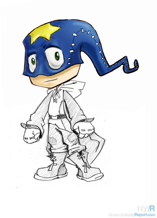
Finally, one particular concept caught Majesco's eye. A quick sketch of a face of a "tailed-mask" they felt was a very unique look for the character. The mask became a type of unusual wizard's hat… a floppy, pointed, blue object with a yellow star stitched on the forehead. Its main distinguishing features are that it lacks a brim and goes over the top of the face, with eyeholes in front. (We explain its unusual construction in the game's intro, voiced by Anthony Stewart Head) The "hat" was made more distinguished by adding several bends in it, so it zig-zagged.
Now, our publisher felt we were on the right track. The final step was to finalize Flip's proportions. While most of our drawings featured characters three to four heads tall, they ushered us toward a design that was two-and-a-half. This keeps him more compact within the 3D, rotatable environment, and more iconic, in line with classic platformer characters such as Mario and Sonic.
 Final model sheet for Flip
The Journey of a Thousand Miles
Over 260 character concepts later, and four months into development, we finally had our protagonist. Now we just had to build the whole game!
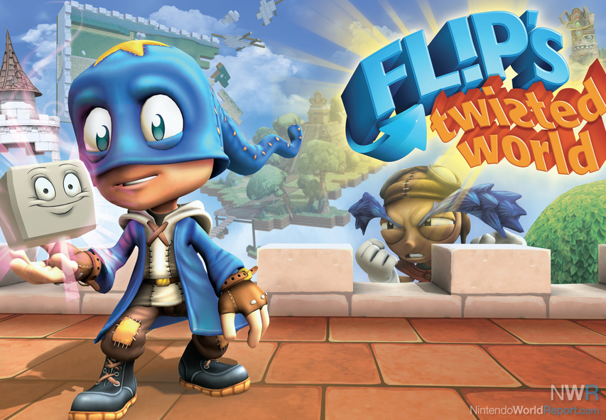 There were even changes made from the final model to the 3D translation.
 |  |


