Check out these 2D beauties, yo.

I’ve said somewhere before that I put more stock in art direction than technical specs. Something like Halo or Call of Duty doesn’t look anywhere near as good or interesting to me as something dynamic and iconic like Patapon or Super Mario Bros. 3. A good portion of Nintendo’s greatest hits are 2D games with a hand-drawn aesthetic, and they are among my favorite games to look at. In a month celebrating WayForward’s splendid remake of A Boy and His Blob, it seems fitting to recall other Nintendo games that celebrate simplicity. It’s becoming harder and harder to find newer games (though they do exist) that commit to the hand-drawn art style.
Earthworm Jim & Earthworm Jim 2
The hand-drawn look of Earthworm Jim melds perfectly with its often layered background paintings. These games look like cartoons (generally—Andy Asteroid levels never looked good), and it’s largely thanks to the animators’ great sense of exaggeration and timing. The transformation of Jim’s canine friend Pete is a thing of beauty. The environments themselves are often stunning in their complexity. The very first level of the first game—New Junk City—is a sprawling trash heap piled high with moose heads, stone spires, endless hills of tires, and a blazing sunny haze. The games looked stunning on the Super Nintendo, and they still look great today.
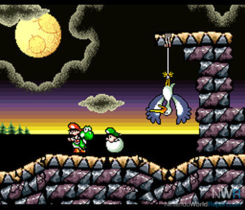 Wait, so the stork thing is true? Have I been wasting my time all these years?!
Super Mario World 2: Yoshi's Island
This game’s stunning aesthetic, which melds chalk, paint, crayon, and colored pencils together to create a rich, brilliantly colorful world, was the result of Mr. Miyamoto wanting his new game to look totally distinct from Rare’s recent Donkey Kong Country. And indeed, though DKC was made with advanced graphics technology, it’s Yoshi’s Island that holds up better, and will continue to do so. It was crafted not with technological supremacy in mind, but with clever art direction and purposeful design decisions that would not be affected by the march of technology. Yoshi’s Island looks as beautiful today as it ever did thanks to its “low-tech” art design. 2D animation is timeless, but 3D polygons (or sprite renderings of polygons) quickly become dated. And, in fact, one could argue that Yoshi’s Island, with its Super FX2 chip, was actually higher-tech than DKC. The chip DID allow sprites to expand and contract in interesting ways, but the technology was used for the BENEFIT of the art direction, not the other way around—as it should be.
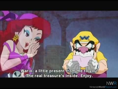 Wario's first thought: "IS IT TREASURE?"
Wario Land: Shake It!
Good Feel knocked this one out of the park in terms of a look. The hand-drawn sprites of the characters mesh beautifully with the painted backgrounds. The whole game looks—and moves—like an animated film. The exaggerated motions, timing, and reactions of the super-smooth characters are jaw-droppingly wonderful, and I can honestly say that no game before or since has managed such a unique look. I was pleasantly surprised by the fully animated introductory sequence, just because you don’t see that anymore. Composed with more care and effort than what goes into most modern television cartoons, the intro sequence is a marvel, and makes me wish for a fully animated feature film starring Wario and Captain Syrup.
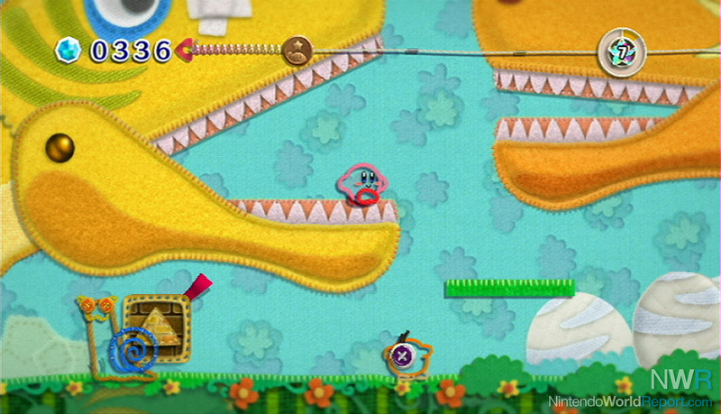 This screenshot proves that people on a...ahem..."higher" state of mental function would perhaps best appreciate Epic Yarn's unique style.
Kirby's Epic Yarn
When you’re talking about unique-looking games, you can’t ignore Good Feel’s second effort, either. You can’t say it looks hand-drawn—more like hand-crafted. You see, Kirby’s Epic Yarn is made of, well, yarn. Everything in the game looks stitched, woven, threaded, sewn, or knit. It’s a beautiful aesthetic that actually leverages the Wii’s graphical “inferiority” to its benefit: yarn looks fuzzy. This game would look horrible in HD because of that. Kirby himself, as well as the rest of the characters in the game, look like simple yarn outlines that morph and unravel and pop apart (buttons and all) with visual pop. The brilliant art direction manages to take familiar Kirby environments—lava, ice, forests, etc. and make them work entirely with handcrafting supplies. You could, theoretically, make a scene from Epic Yarn yourself—a handmade screenshot, if you would. I don’t know of many games which allow that.
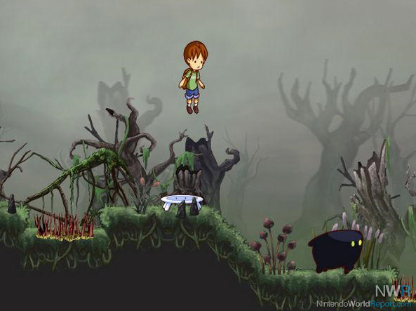 I make it a point to hug the Blob after basically repeatedly bouncing on his face to reach a higher area.
A Boy and His Blob
The focus of this month’s NWR Game Club is beautiful in its simplicity. There aren’t many moving objects. It’s really just the titular boy and his morphing white blob. Toss in a few simple enemies, and there you go. The eye-popping effort goes into the subtlety of the character animations: the infamous hug, the boy calling to his friend, or the boy tumbling head over heels on a trampoline look crisp and fluid. This is hand-drawn animation at its finest. Especially striking are the multitude of environments and backgrounds, the use of lighting, and the sound design in crafting atmospheric, often foreboding places. The Boy’s tree house feels calm and welcoming; the Blob home world is at once alien and exciting; and the caverns and dark forests are oppressive and spooky. The game’s simplistic style is so successful that I feel like the larger, more complicated boss characters are inferior to the smaller characters in the game!
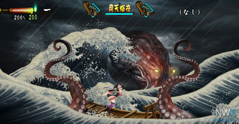 The Wii's prettiest 2D game? It's very possible.
Muramasa: The Demon Blade
Developer Vanillaware has a talent for crafting 2D masterpieces. Before Muramasa, they did GrimGrimoire on the PlayStation and Odin Sphere on the PlayStation 2. I have a special place in my heart for the latter, and I consider it the best-looking game on the system (too bad about the framerate issues). The company’s calling card is amazing-looking scrolling backgrounds and complicated character designs that have insane amounts of animation. Muramasa: the Demon Blade is the company’s first foray onto a Nintendo system, and what a beauty of a game it is. The environments are varied and increasingly complex—one in particular takes place on a story sea that must be seen to be appreciated. Boss characters are typically enormous and feature multiple moving parts. Everything about this game is gorgeous, even when it’s being repetitious (and it is). I can’t wait to see how Dragon Crown (out later this year for PS3/Vita) turns out based on Vanillaware’s prior efforts.
Dude, this game is on CRACK.Rayman Origins
Maybe the prettiest (and toughest) 2D side-scroller of the last few years, Ubisoft’s Rayman Origins takes the cake in terms of visual eye-candy. We’re talking about funky characters with wacky, hand-drawn animations and gorgeous backgrounds with incredible colors, multiple layers, and insane levels of detail. The game is also creatively brilliant—two worlds are composed of wind instruments (with birds that sit on musical scales), another is more cocktail drink than ice environment, and another involves bellows, boiling pots, and fire-breathing saurian chefs. The boss characters in particular are huge, multi-segmented, and generally hilarious. Though I died about 30 times battling the secret final boss, I never stopped chuckling at her reaction to seeing Rayman hop onto her arm.

